"There is no such thing as a bad artist, only those who dont understand."
Tyler Gogan


Tuesday, July 31, 2012

A little bit on action in your scene

Alright i thought i might talk about what you should do when trying to decided on what your entire clip is going to be about. This is for newbies as well as people that have been doing it for a long time. When i first started I would be so concerned about the attitude and the mood the character was in. I did this in all my assigments and do it still to this day, anyway, when executing your scene try not to give the character an attitude, I like to call it acting in my scene, try not to have the character act, see how much faster and easier you will get things done. Now, im not saying not to have your character always not portray a mood in any of your scenes because that obviously plays a big part, but just try and have him using his body, dont use the face in any way shape or form, maybe an expretion at the end with the gag but thats it, the audience with understand what is going on if you just have the chatracter using just their body, when putting acting in the scene it just makes it harder for yourself. Dont be affraid not to use facial expretions, you might get to the point of over animating and trust me it is frustrating having to go back and cut things out becuase you put to much in it. Just putting action in your scene will somewhat make the acting for you.
Remeber try not to put to much in your scene, just put enough to get the point across, you dont want to have to animate more than you need to.


I posted this link of this spaceman bit, i think that he is a perfect example of what i just explaned, you cant really see his face at all but just with the way he stands and moves you are able to understand what he is feeling and what mood he is putting off.

Quote of the Day

"Creativity is allowing yourself to make mistakes, art is knowing which ones to keep"
Scott Adams

Monday, July 30, 2012

More awesome inspiration

Hey everyone here is some more really awesome inspiration, i really enjoyed watching the bits on how the characters handled weight as they were  lifting it, it was really believable, this is some really good stuff that i think everyone can look at and better their own animation. I have attached the link below.http://vimeo.com/44206936

Quote of the Day

"The artist is nothing without the gift, but the gift is nothing without the work."
Emile Zola

Sunday, July 29, 2012

Quote of the Day

"The artist belongs to his work, not the work to the artist."
Novalis

Saturday, July 28, 2012

Character, and emotion


Alright everyone this is one my favorite subjects when creating a short, movie or what ever it is that you are doing. The character is the most important part of the movie, they make the audience have emotions, whatever they feel the audience feels, if their heart breaks then audience heart brakes. It is not only important to make the audience laugh but as well as make them cry, or feel depressed or sad. Now i know that the character does not just do that themselves, the envirnment and lighting and all that has to do alot with it, but that is an entirly different monster all in itself. The character though is probably about 70-80% of why you are feeling sad for them. You need to find your target audience that you want to make feel all of these emotions that you are trying to portray. My personal Favorite audience is family, its kids and grownups mixed into one. So you get to do many things in your film, but that doesnt mean its the easy way out, you still need to find things that both will understand and relate to.

My most favorite scene that portrays emotion of all time in any movie that I have ever scene is in Toy Story 3. This movie was for all adiences but mostly for a family setting. Pixar really captured everyones emotion when the toys were about to be destroyed, why, because they made the audience love them, and care about them, the toys didnt want to be destroyed and the viewers didnt want them to be destoyed either. I will be the first one to admit that when i watched it for the first time i was balling like a baby.
Now I know that they had three movies to make you really care about what happened to these lovely toys, but that is part of the challenge, making your audience care in the amount of and hour or two. Even in the first Toy Story i cared a lot about what happened to the toys. When Andy lost his toys i wanted him to get them back.

But enough on how the emotion is suppose to be portraid for now and back to more on how you can understand the different moods of your characters, for animators or yourself. Before you get going on making a fanomanal movie with said character, plan out how they look when they feel their certain emotions, this is called a character spreadsheet or character layout, call it what you will it is for the characters emotions.And dont be affriad to really push the emotion of the character, the audience will really play into that and really feel it.

Take Ben here for example, there are 7 diffferent emotions here on how he feels throughout the movie. Doing this will help you not get confused about how the characters moods are portraid, the more you confuse your audience the crappier and less funny your film is going to be.
So remember always keep your charcters emotions clear and dont switch things up when they feel the same thing in differnt parts of the film. Here are some more of the spreadsheet examples.


Below are some of my own simple sketches of a character worksheet/ spreadsheet.


Quote of the Day

"A picture is a poem without words"
Horace

Thursday, July 26, 2012

More on poses

Heres a quick sketch of my own pose, its not to complicated but it still shows that you can keep it simple

Quote of the day

"Every artist was first an amateur."
Ralph Waldo Emerson

Poses, line of action and weight

I came across this subject today and i thought i might give a few remarks to everyone out there, It applies to 2d and 3d as well.
 Alright this is for all you aspiring animators, citizens, kids, or whoever just appretiates artwork and wants to make theres look fantastic.
Its all about the pose your character is in.( remember, this is for animation, as well as your REGULAR EVERYDAY ART WORK.)
There are a couple things to consider first before you start laying down the pencil on the peice of paper. First, think about what your character is doing, think about his mood, are they happy, are they sad, are they exited, or are they angry, you can very easily convey a mood without a face gesture with simply putting your characters body in the right position. Second, as soon as you decide the mood and position your characters, throw some simple lines down to show the beautifil curves of your character without haveing them on the paper yet. Take King looey for example, when he is holding himself up with his one arm.
I have drawn some lines for you just starting with the basics, plan out the pose first and put those lines in where you want those curves to be. Just take a look how his arms make the beautiful curves, going from one hand down to the other.
Third, weight consideration is probably up there with the top 5 most important things you should look for, make sure that the weight is destributed equally on both sides of the body, make sure that one side doesnt look heavier than the other. Again take a look at this glorious ape. You dont see his hand going strait down to the ground from his head, it is slanted going strait down more from about his rear, and his other hand is extending outward to counter that balance issue. Also be aware of where the weight of the character is going, what part of the body it is being pressed on or against. You and see that his arm is making a strait line going down to this hand, appose to his other arm, it looks more free and loose. Strait lines give more weight to wherever you are putting the weight, curvy bendy lines give less weight, a more loose, free feeling.
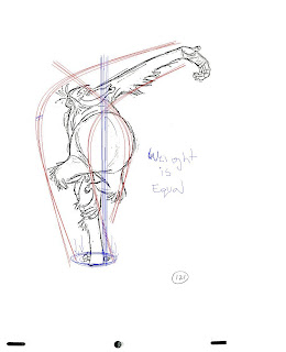
Dont get to caught up in making your character look good at the start, take the time to plan out what you want your character doing, be sure sure to add your curves and some loose feeling as well as weight to your drawing.
Remember, dont fall to much in love with your drawing/ artwork, infact i would highly consider drawing something that is absolutely pleasing to the eye and that you are so proud of, and after you show a couple people how good you have done, just rip it up and draw it again, or maybe just rip it up before showing it to anyone, it teaches you not to be so disapointed if you loose it or mess it up in the first place. 
So again dont fall to much in love with your artwork, it can always be done again, you did it once and you most certainly can do it again, trust me it pays off in the long run.
I have thrown up a sketch of Rider from Tangled, I will let you look for the line of action and the curves his body makes, and where his weight is.


Wednesday, July 25, 2012

Inspiration


http://www.animationmentor.com/campaign/showcase-2012/
I came across this it and thought that it was amzing inspiration for animators (I attached the link above), there is a lot you can take from it, look closely at the emotion and timeing of things, if you cant exagerate the emotion in the scene and really get your audience to become apart of it, then you dont have a solid scene, and everything becomes a mess.

Fish boy project

Hey everyone this is the fish boy project, a man by the name of Andrew Conroy has put a free downloadable rig on his blog(acprojectspace.blogspot.com) and his name is fishboy, his purpose is to help people possibly get loans to start up there own businesses. When you go to Andrew's blog it will explane that when downloaded, you simply donate some money to help others in need, but again, it is not required and he is downable for free. He as well has a tutorial on how to use fish boy.

I have worked with fishboy and he is great, he is made in such away that it is possible to get really nice curves and lines with his body, he really brings you back to the fundamentals of animation with the classic floursack look and feel, just a little fishier.

Quote of the day

"Art enables us to find ourselves and lose ourselves at the same time."
Thomas Merton

Tuesday, July 24, 2012

Quote of the day

"No great artist ever sees things as they really are, if he did, he would cease to be an artist


The art of Glen Keane is just fanominal.

THE ART OF GLEN KEANE.: DRAWING RAPUNZEL

THE ART OF GLEN KEANE.: DRAWING RAPUNZEL: thanks to Amir Al-Zubi !!
Check out this video of how he created Rapunzel, this guy is awesome.

Monday, July 23, 2012

Quote of the day

"This world is but a canvas to our imagination."
Henry David Thoreau

Billy

Created this little guy about a month ago and in the procees of rigging him, take a look at the way his body is made, makes room for good lines while creating poses. the way his belly contrasts his feet, he goes from small, to wide, to small. As well as the fat on his face, when he goes into a smile the fat under his eyes bunches up. Feel free to let me know if any of you would like to agree or disagree on this, and also feel free to critique him as much as you like, i am open to adjusting any part of him

Sunday, July 22, 2012

Quote of the day

"An artist never really finishes his work, he merely abandons it."

Saturday, July 21, 2012

Quote of the day

"Every child is an artist, the problem is how to remain an artist once you grow up